
I remember standing in a drafty church hall back in ’94, staring at a beautifully printed, glossy flyer for our neighbourhood clean-up day. It was a work of art, truly, but it was completely useless. The font was a swirling, illegible mess, and the date was tucked away in a tiny corner like a secret. People walked right past it without a second glance. I learned then that knowing how to design a poster that works has absolutely nothing to do with how much money you spend at a professional print shop; it’s about making sure a busy person can grab the essential facts in the three seconds it takes to walk past a noticeboard.
I’m not here to teach you about colour theory or expensive software that nobody in a community group has the time to learn. Instead, I want to share the practical, no-nonsense methods I used during my thirty years in local government to actually get people through the door. I’m going to show you how to strip away the clutter and focus on the only things that matter: clarity, visibility, and a call to action that people can actually follow.
Understanding How to Design a Poster That Works
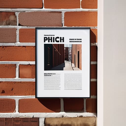
When I was working in local government, I saw countless beautiful, glossy flyers end up in the bin because they were too cluttered to read. If you want your message to land, you have to respect the way people actually look at things. They don’t read a poster like a book; they scan it in a heartbeat. This is where visual hierarchy becomes your best friend. You need to decide what the single most important piece of information is—maybe the date of the community meeting or the name of the fundraiser—and make sure it hits them first. Everything else should follow in a logical order, guiding the eye from the big headline down to the smaller details.
Don’t get bogged down in fancy software, either. You can achieve a great result by focusing on effective typography and keeping things tidy. If you use three different curly fonts, your neighbors will just see a jumble of ink. Pick one clear font for the main info and maybe a simpler one for the specifics. It’s about being clear, not being clever. If the eye doesn’t know where to land, the message is lost, and quite frankly, it’s a waste of good paper.
Key Things to Know
First, don’t let the technical jargon intimidate you. You don’t need a degree in fine arts to get the message across; you just need to understand visual hierarchy in graphic design. This is really just a fancy way of saying you need to decide what the most important bit of news is. If you’re announcing a street clean-up, the date and the meeting point should shout louder than the bit about bringing your own gloves. If everything is the same size, nothing is important, and people will simply walk right past your notice.
Secondly, keep your eyes on the text. I’ve seen so many lovely community flyers ruined by trying to use five different curly fonts that are impossible to read from three feet away. You want effective typography for posters that is clear, sturdy, and honest. Pick one or two styles at most. If the font is too fussy, your message gets lost in the decoration. We aren’t trying to win design awards; we are trying to make sure Mrs. Higgins knows there is a tea social on Tuesday. Keep it simple, keep it legible, and get to the point.
Practical Tips and Steps
First, don’t let the blank page intimidate you. I’ve seen too many lovely community projects fail simply because their notice was tucked in a corner or written in a font no one could read. Start with your most important bit of information—the date, the time, or the “why”—and make it big. This is where visual hierarchy in graphic design stops being a fancy term and becomes common sense; if everything is shouting, then nothing is being heard.
Next, keep your tools simple. You don’t need a professional studio; a steady hand and some decent markers will do if you focus on composition and layout techniques that guide the eye downward. Avoid the temptation to fill every inch of white space with clip art or unnecessary flourishes. A bit of breathing room around your text actually makes people stop and look. Most importantly, ensure your call to action design is unmistakable. If you want them to visit a website or show up at the community hall, tell them exactly what to do next, and make sure they can see it from three feet away.
Common Mistakes to Avoid
The biggest blunder I see—and I’ve seen it in a hundred parish hall meetings—is trying to say everything at once. People think a poster is a replacement for a leaflet, so they cram in every single detail about the bake sale, the raffle, and the church roof fund. When you do that, you lose any sense of visual hierarchy in graphic design. If every word is shouting, nobody is actually heard. You end up with a cluttered mess that people simply walk past because their eyes don’t know where to land first.
Another trap is getting far too precious about the “look” of it. I once saw a lovely group spend three weeks arguing over a font, only to realize they’d used a script style that was impossible to read from five feet away. You don’t need fancy flourishes; you need effective typography for posters that gets the message across to a busy person on the street. If your font is too small or too decorative, your hard work is wasted. Keep it simple, keep it legible, and for heaven’s sake, make sure the date and time are the easiest things to find.
Final Thoughts
At the end of the day, don’t let the fear of doing it “wrong” stop you from putting something up on the community noticeboard. I’ve seen plenty of beautifully printed, professional-looking flyers end up in the bin because they were too clever for their own good. You don’t need a degree in graphic design to make an impact; you just need to be clear. If you focus on a bit of effective typography for posters—making sure the date and the time are actually readable from three feet away—you’ve already done more than most.
Remember, a poster isn’t a piece of art for a gallery; it is a tool to get people through a door. Whether you are using bold colors or sticking to a more minimalist poster aesthetic, the goal remains the same: clarity over decoration. Keep your message simple, make your call to action obvious, and for heaven’s sake, get it stuck to the wall. Once it’s up, the real work of building the community begins.
Five things I’ve learned from thirty years of community noticeboards
- One big idea, not five. If you try to tell people about the coffee morning, the flower show, and the lost cat all on one sheet, they won’t read any of it. Pick one thing and make it the star.
- Watch your font size. I’ve seen so many lovely posters for parish meetings that were unreadable because the text was too small. If someone can’t read it while walking past the community centre, it might as well be blank.
- Use the “squint test.” Hold your poster at arm’s length and squint your eyes until everything gets blurry. If you can’t tell what the most important part is through the blur, your layout is too cluttered.
- Don’t forget the “When and Where.” It sounds silly, but I’ve seen brilliant posters that forgot to list the actual date or the room number. Always double-check that the basics are staring people in the face.
- Leave some white space. You don’t need to fill every square inch with clip art or borders. A bit of breathing room around your words actually helps the important bits stand out more.
The Golden Rule of the Noticeboard
A poster isn’t a piece of art for your living room; it’s a tool to get someone to stop, read, and actually show up. If they can’t tell what’s happening and when it’s happening from five feet away, you haven’t made a poster—you’ve just made a bit of clutter.
Deborah Castellanos
A Final Word Before You Print
At the end of the day, a good poster isn’t about being an artist; it’s about being a good neighbour who knows how to communicate. We’ve talked about keeping your message simple, making sure that date and time are impossible to miss, and avoiding the temptation to clutter every inch of white space with unnecessary fluff. If you can manage to get the essential facts across clearly and use a font that doesn’t require a magnifying glass, you are already ahead of most of the notices I see pinned to our local community boards. Remember, the goal isn’t to win a design award; it is to make sure people actually show up.
I spent three decades in local government watching wonderful community initiatives fizzle out simply because they couldn’t get the word out effectively. Don’t let your hard work go to waste because of a poorly designed notice. Whether you are raising funds for a new playground or just trying to get a few more people to join your gardening club, your poster is your first handshake with the street. So, grab those markers, keep it legible, and get it out there. A single, clear piece of paper can be the very thing that turns a quiet group of strangers into a vibrant, active community.
