
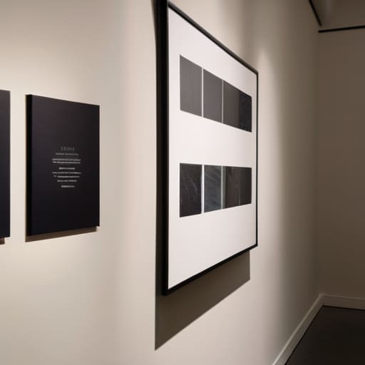
I remember standing in a drafty community hall during my final year in local government, watching a lovely local photography display go completely ignored. The talent was immense, but the little white cards next to the frames were filled with such dense, academic jargon that people simply walked right past them. It’s a common mistake to think you need a degree in art history to explain a local project, but when it comes to how to write captions for an exhibition, complexity is actually your enemy. If a neighbour can’t understand what they’re looking at within ten seconds, you haven’t shared a story; you’ve just cluttered the room.
I’m not here to give you a lecture on curatorial theory or expensive professional copywriting. Instead, I want to show you how to use those few square inches of paper to build a bridge between the art and the street. I’ll be sharing the practical, plain-English methods I’ve used to keep community projects engaging and, more importantly, meaningful. We are going to focus on writing labels that actually connect with people, ensuring your hard work gets the attention it truly deserves.
Beyond the Frame How to Write Captions for an Exhibition
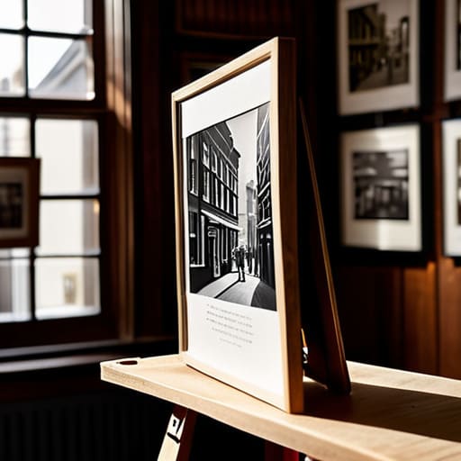
When I was working on the regeneration projects in the East End, I learned that people don’t just look at things; they look for a reason to care. If you are setting up a local display in a community hall or a small library, your text shouldn’t just be a dry list of dates and names. You need to use curatorial storytelling methods that bridge the gap between the object and the person standing in front of it. Don’t just tell them what the photograph is; tell them why that specific corner of the street mattered to the people living there in 1974.
The real secret to engaging museum visitors through text is to stop writing like a textbook and start writing like a neighbor. If your wall text is too academic, people will simply walk past it. I always tell my committee members that the goal isn’t to show off how much we know, but to invite the community into the conversation. Keep your sentences short, your language plain, and always aim to spark a memory or a question that keeps them looking just a little bit longer.
The Label as Leverage Mastering Curatorial Storytelling Methods

When I was working on the regeneration projects in the old textile district, I learned that people don’t connect with objects; they connect with the stories those objects carry. This is where curatorial storytelling methods become your most useful tool. If you are just listing the artist’s name and the date, you are wasting a golden opportunity. Instead, think of your text as a bridge. You want to take someone walking past a display and pull them into the local history. If a photograph shows a demolished corner shop, don’t just tell them it was built in 1924; tell them it was where the neighborhood gathered every Tuesday for tea.
To do this well, you need to move away from the dry, academic tone I often saw in the local archives. Proper gallery text best practices involve using language that is accessible but not patronizing. I always tell my committee members: write like you are explaining the piece to a neighbor over the garden fence. Keep your sentences short and your observations sharp. When you use the wall text to provide contextual weight, you turn a simple collection of items into a meaningful community landmark.
Words That Work Proven Gallery Text Best Practices
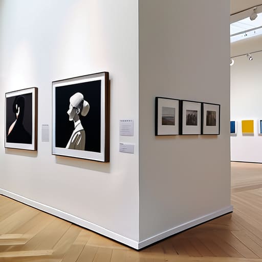
When I was working in regeneration, I learned that if you don’t speak clearly, people simply walk past. The same applies to your exhibition. One of the most important gallery text best practices is to respect the reader’s time and energy. Avoid the temptation to write a thesis on the wall; most people are looking for a connection, not a lecture. Keep your sentences short and your vocabulary accessible. If a grandmother from the local parish can’t grasp the core idea of a piece within thirty seconds, you’ve likely lost her.
I also suggest you vary your approach to keep the momentum going. Instead of every label being a dry biographical sketch, try mixing in some sensory details or local history. This is where true engaging museum visitors through text happens—by bridging the gap between the object and the person standing in front of it. Don’t be afraid to use a bit of warmth in your prose. You aren’t just providing information; you are inviting the community into a conversation.
Small Text Big Impact Museum Label Writing Techniques
When I was working on the regeneration projects in my old borough, I learned that people don’t read long-winded reports posted on community boards; they skim, they scan, and if it looks like a chore, they walk right past. The same applies to your exhibition. You need to master certain museum label writing techniques that respect the visitor’s time. Keep your descriptions lean. If a label is longer than a short paragraph, you aren’t providing context; you’re providing a lecture, and most people aren’t in the mood for a classroom setting when they’re out looking at art.
Instead of a wall of text, try to find that one singular, striking detail that connects the piece to the person standing in front of it. Whether you are using professional gallery text best practices or just writing something heartfelt on a printed card, the goal is to create a bridge. A good label shouldn’t just tell them what the artist used; it should tell them why the artist cared. When you get that right, the text stops being an instruction manual and starts being an invitation.
The Art of Connection Engaging Museum Visitors Through Text
When I worked in regeneration, I learned that people don’t engage with a project because of a glossy brochure; they engage because they feel seen. The same applies to your exhibition. You aren’t just providing information; you are building a bridge between the object and the person standing in front of it. To master engaging museum visitors through text, you have to stop thinking like an academic and start thinking like a neighbour. If a grandmother walks into your community gallery, she shouldn’t feel like she needs a PhD just to understand why a particular photograph matters to this street.
The secret lies in finding the human thread. Instead of dry, clinical descriptions, use your labels to pose a question or highlight a shared memory. This is where curatorial storytelling methods truly shine—not in the heavy lifting of historical dates, but in the small, evocative details that make a viewer pause. If you can make someone feel a sense of connection to a piece of local history, you’ve done more than just display art; you’ve started a conversation that keeps your group relevant for years to come.
Designing the Dialogue Effective Museum Signage Design Strategies
When I was working in regeneration, we learned quickly that if a sign is too small or tucked into a dark corner, nobody reads it—no matter how brilliant the content is. The same applies to your display. You can have the most moving curatorial storytelling methods in the world, but if the font is a tiny, spindly serif that requires squinting, your message is lost. I always suggest thinking about the physicality of the reader. People aren’t standing still in a library; they are moving, drifting, and often distracted.
To achieve effective museum signage design, you must balance aesthetics with accessibility. This means choosing a clean, sans-serif typeface and ensuring there is enough “breathing room” around your text. Don’t crowd the wall; white space isn’t wasted space, it’s a guide for the eye. If you are following an art exhibition wall text guide, remember that placement matters as much as the words. Mount your labels at eye level—roughly 150cm for most adults—so the dialogue between the viewer and the piece feels natural, not like an obstacle course.
Five Rules of Thumb for When You’re Standing in Front of the Display
- Write for the person who is tired. We’ve all been there—walking through a community hall or a local gallery after a long day, and the last thing we want to do is decipher a dense, academic paragraph. Keep your sentences short and your ideas even shorter. If they can’t digest the meaning in thirty seconds, you’ve lost them to the next thing.
- Avoid the “Artist Statement” trap. Just because the person who made the piece used big, sweeping words doesn’t mean your caption should. I’ve seen too many local exhibitions fail because the text felt like it was trying to pass a university exam. Your job isn’t to prove how smart the committee is; it’s to explain why the person standing there should care.
- Give them a “hook” in the first line. Don’t start with “This is a photograph taken in 1974.” Start with something that grounds them in the street or the history they know. Try: “This view of the High Street shows what we lost when the old bakery closed.” Give them a reason to lean in.
- Watch your jargon like a hawk. In my thirty years in local government, I learned that nothing kills community engagement faster than “official-sounding” language. If you wouldn’t say it to a neighbour over a garden fence, don’t put it on a printed label. Use plain, honest English.
- Always include the “Who, What, and Where” clearly. It sounds basic, but when you’re rushing to get an exhibition ready for a weekend opening, these details often get muddled. Ensure the artist’s name, the medium, and the date are easy to find at a glance. If people have to hunt for the facts, they’ll stop looking at the art altogether.
## The Purpose Behind the Plaque
Don’t treat a caption like a dusty museum inventory number; treat it like a conversation over a garden fence. If your text only tells people what the object is, you’ve missed the point. You need to tell them why it matters to this street, this neighbourhood, and this moment in time.
Deborah Castellanos
The Final Word on Your Exhibition Labels
At the end of the day, writing these labels isn’t about being an academic or using fancy, polysyllabic words to sound important. It’s about the practicalities of connection. We’ve talked about everything from the technicalities of signage design to the importance of giving a piece its proper context, but it all boils down to one thing: clarity over cleverness. If a neighbour walking past your community display can’t understand why the work matters within thirty seconds, you haven’t quite hit the mark. Remember to keep your text concise, your tone inviting, and your stories grounded in the reality of the people you are trying to reach. When you get the words right, you aren’t just describing an object; you are building a bridge between the art and the street.
I’ve seen so many wonderful local projects fizzle out because they lacked that final bit of cohesive structure, and I don’t want your exhibition to be one of them. Don’t let your hard work go unnoticed simply because the descriptions were too dry or too tucked away. Use these words as your tool to invite people in, to spark a conversation, and to make them feel like they truly belong in the space you’ve created. You have the vision and you have the talent; now, just go out there and write it into existence.
